Oakville Hornets Apparel
This project focused on creating custom apparel designs for the Oakville Hornets Girls Hockey Association to provide players and fans with unified apparel options while modernizing the association’s online store presence.
Role
Graphic Designer
Scope
Apparel Design & Product Mockups
Tools
Illustrator & Photoshop
Client
Oakville Hornets Girls Hockey Association
Problem
The Oakville Hornets Girls Hockey Association had not refreshed their apparel designs in several seasons, leaving players and fans with outdated gear and limited options across the organization. REP players were restricted to one design only, and players at lower levels could not wear that design at all. From a user experience perspective, the existing system did not support the needs of different user groups within the association.
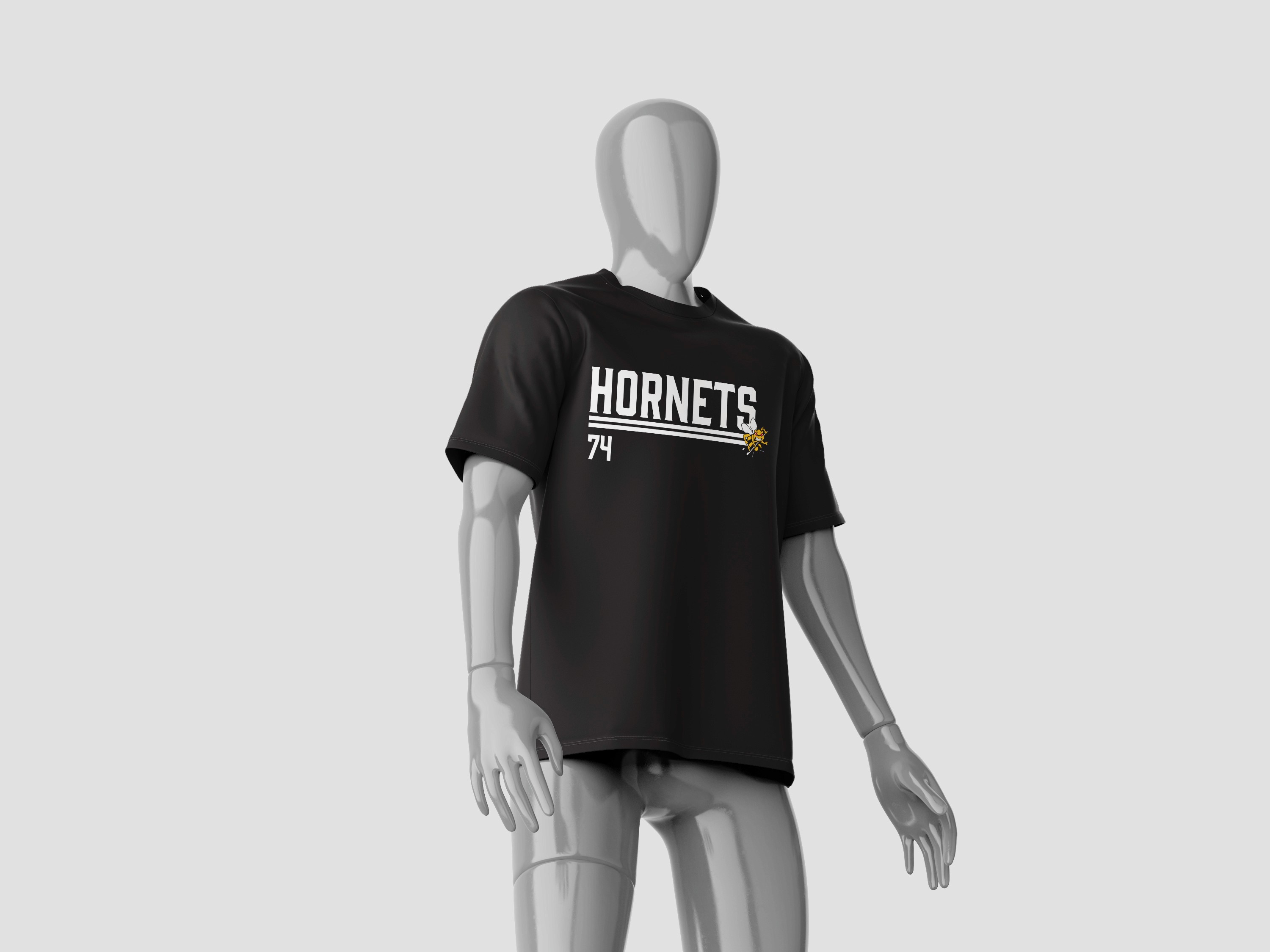
Previous Player Designs
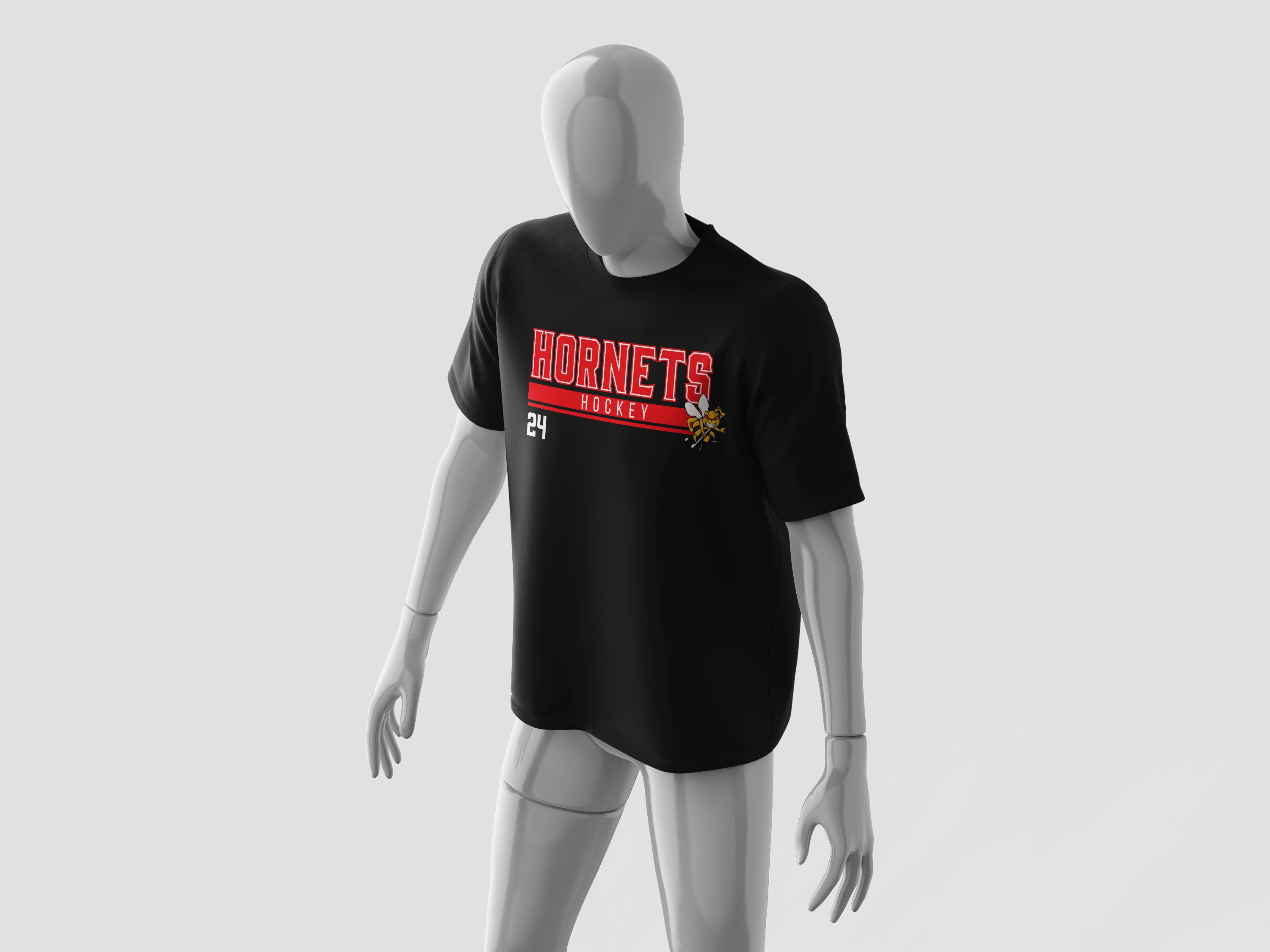
Previous Fan Apparel Designs
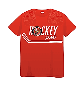
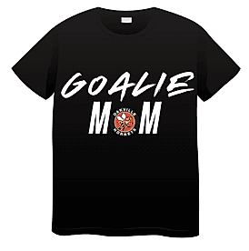
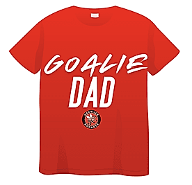
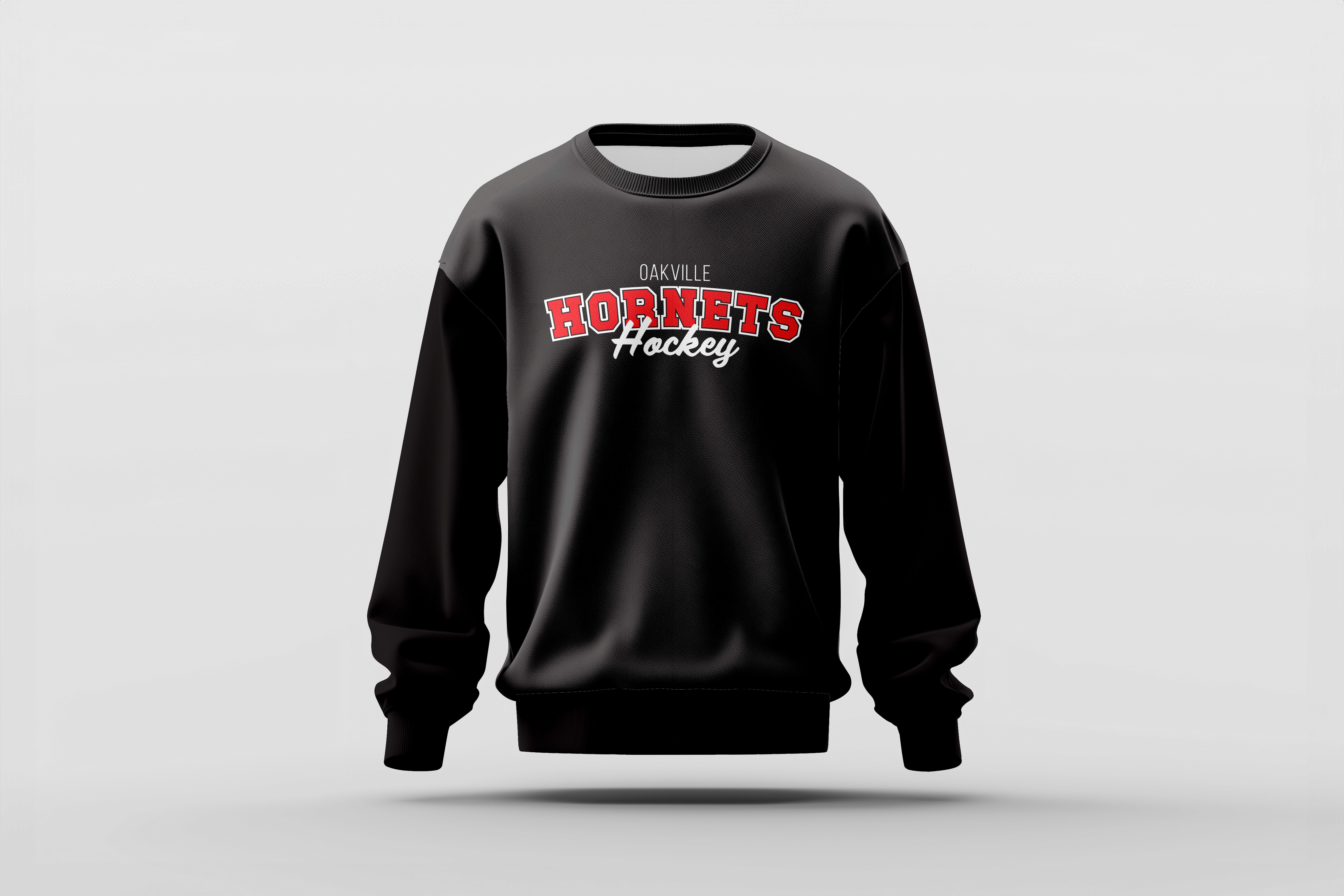
Solution
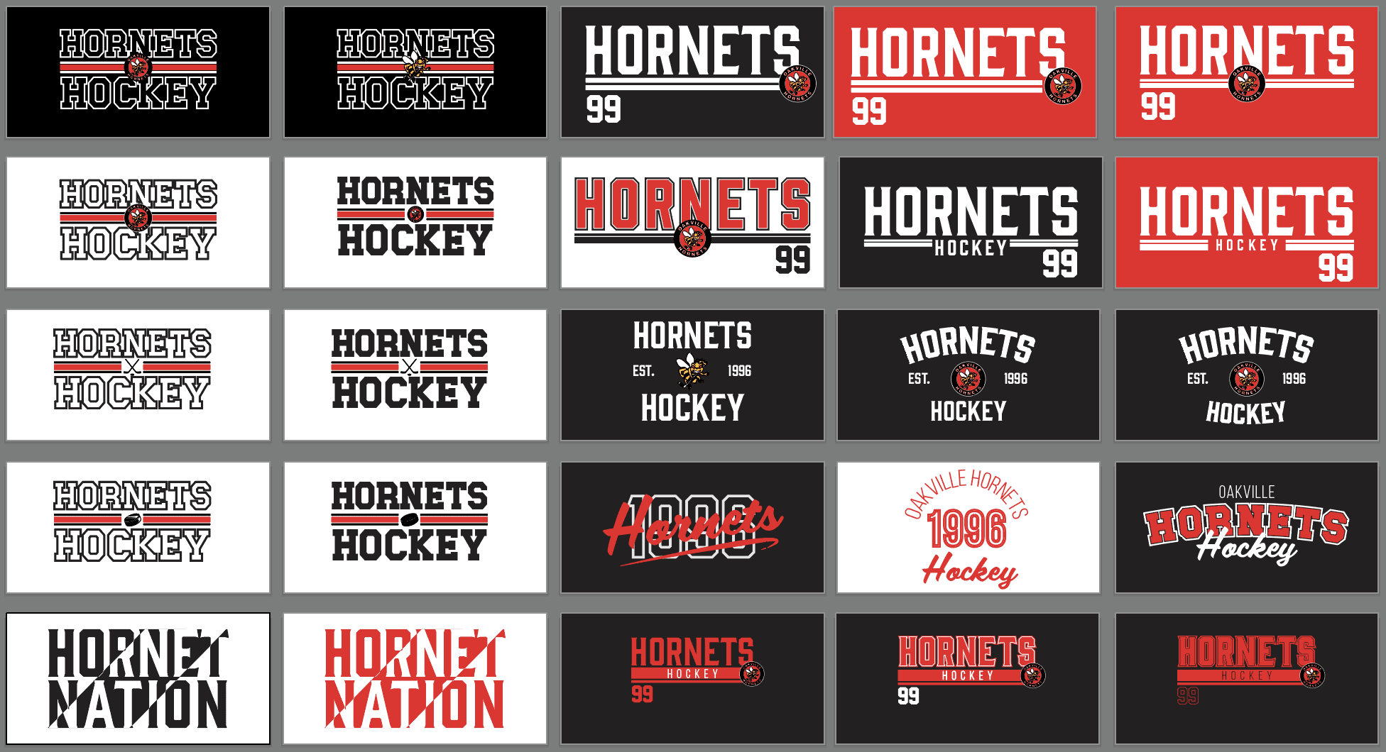
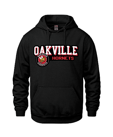
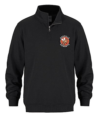
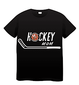
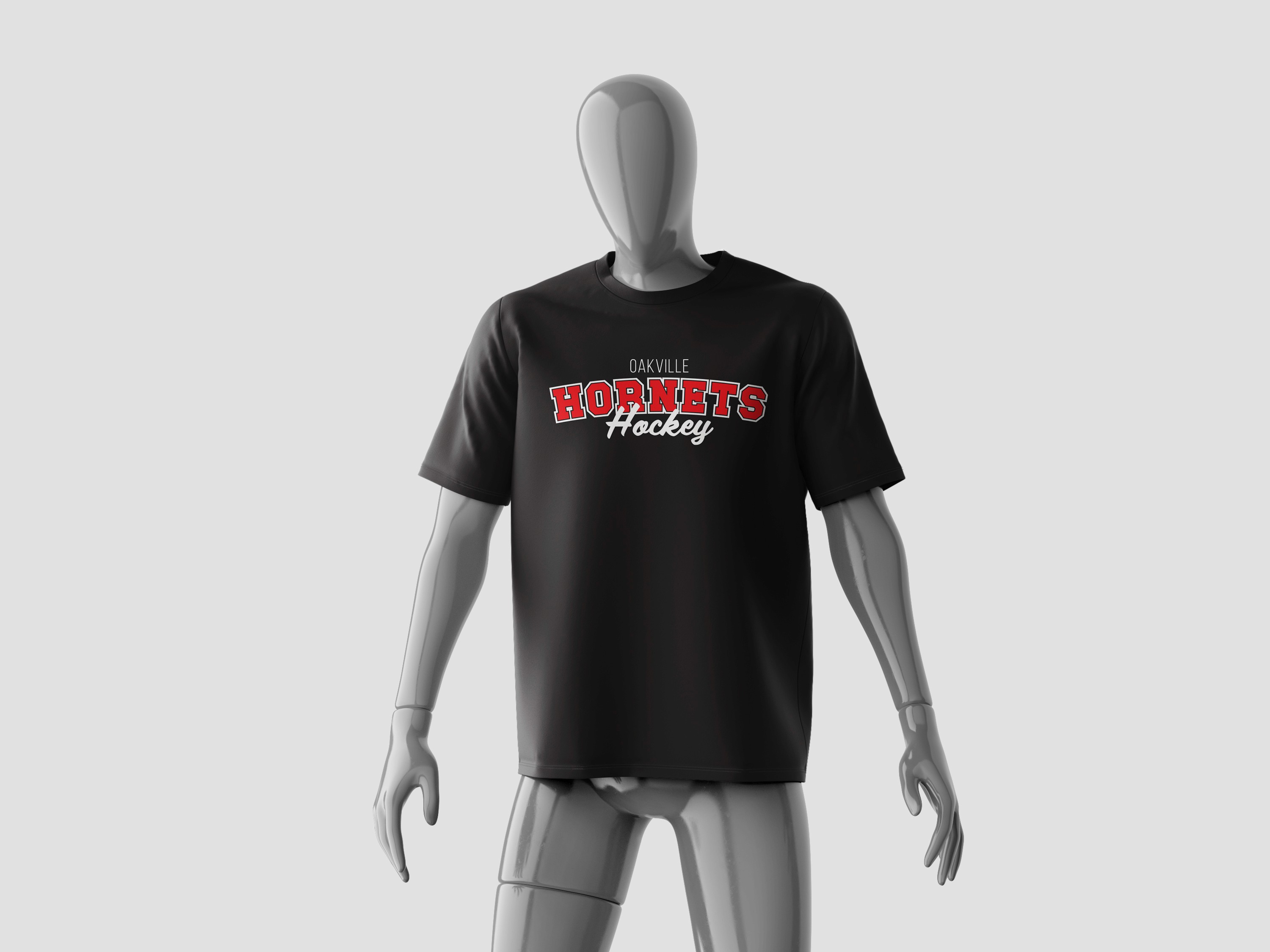
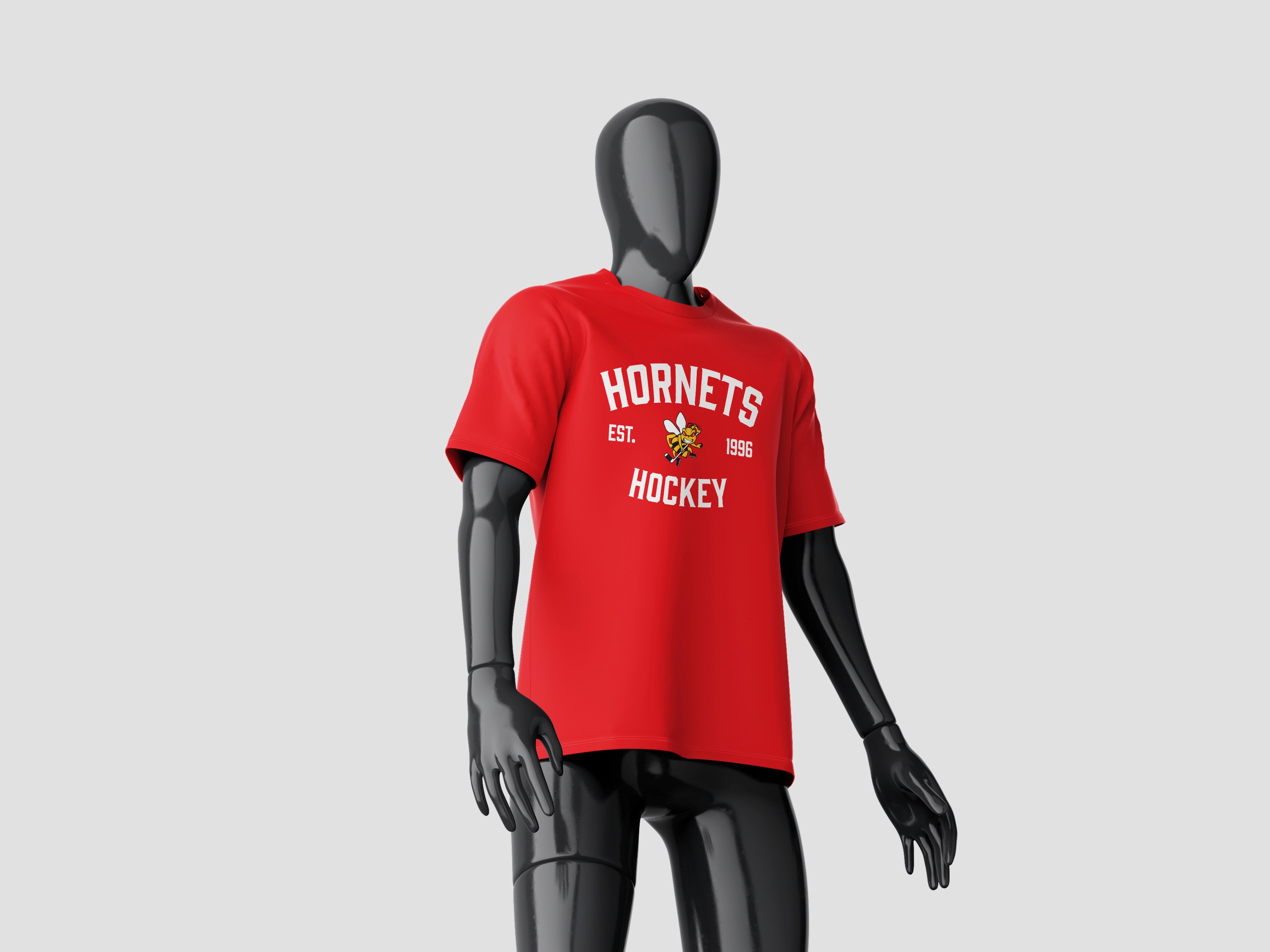
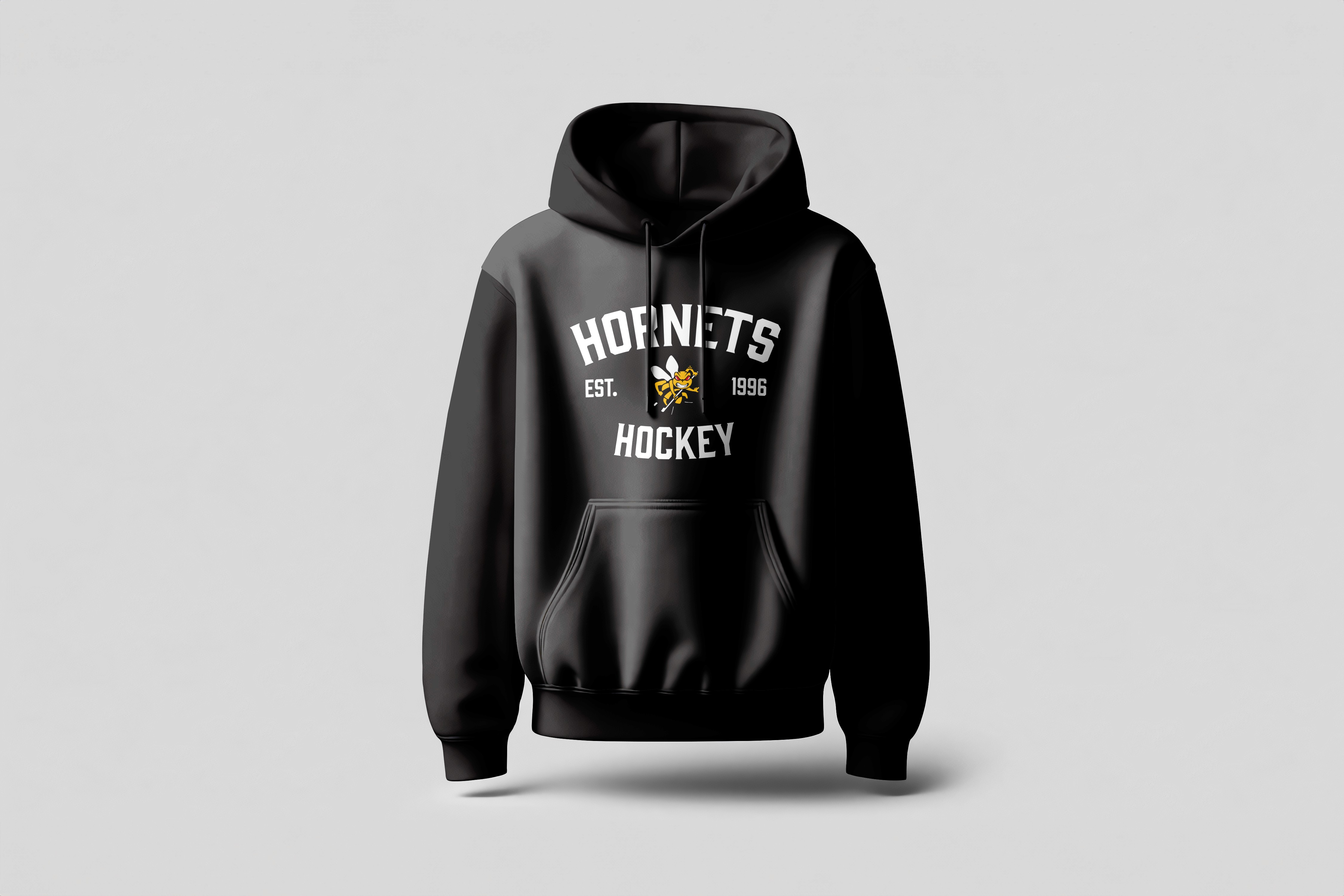
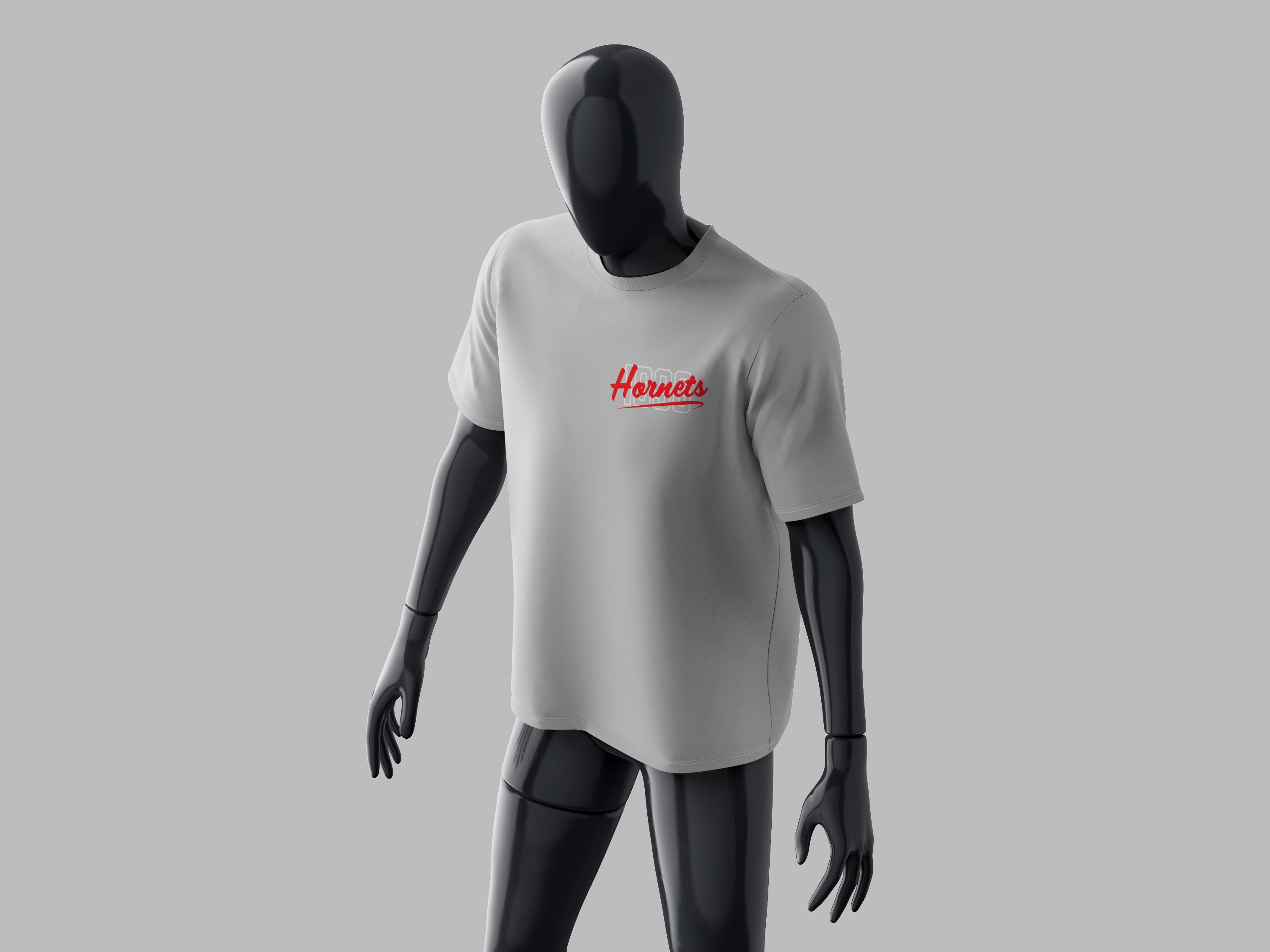
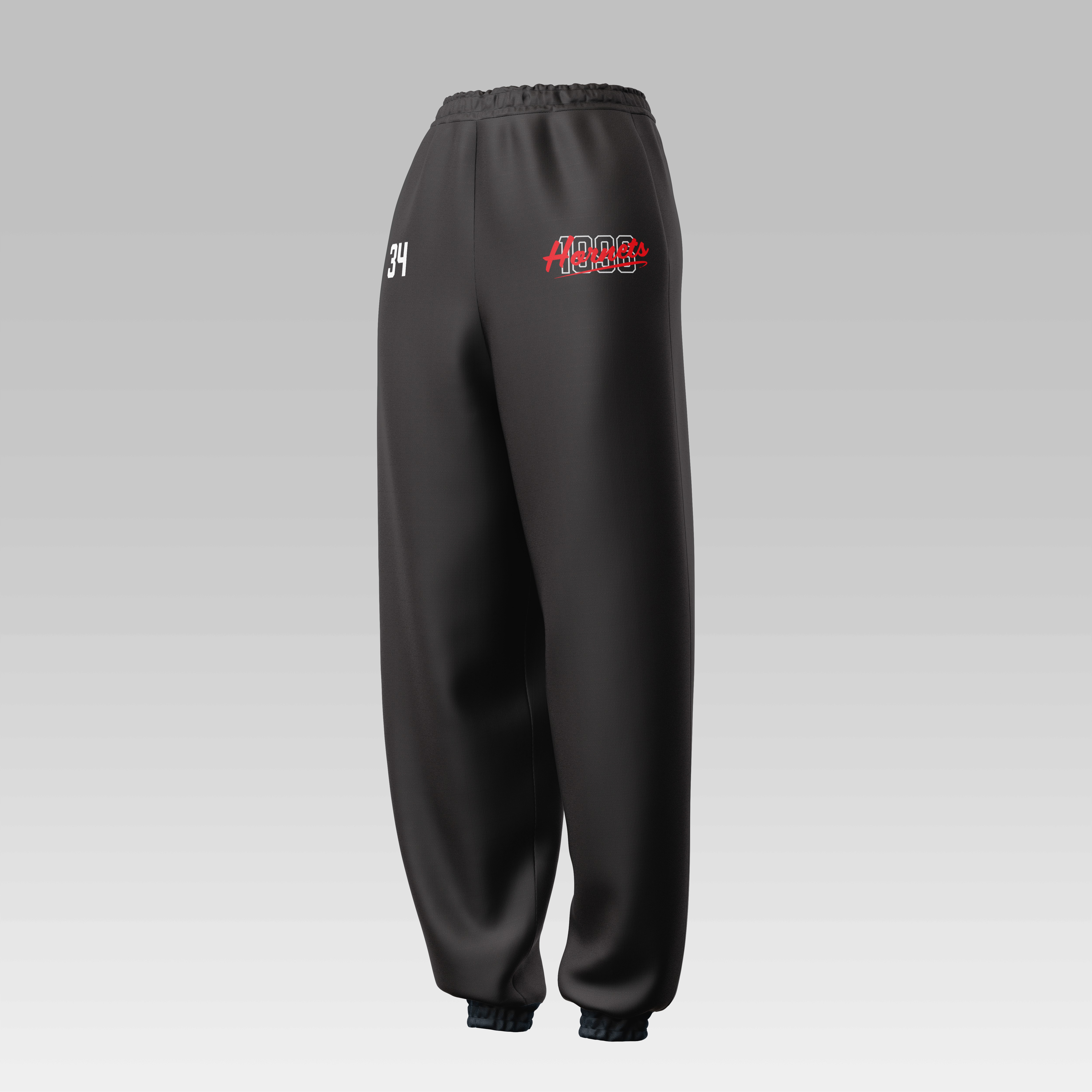
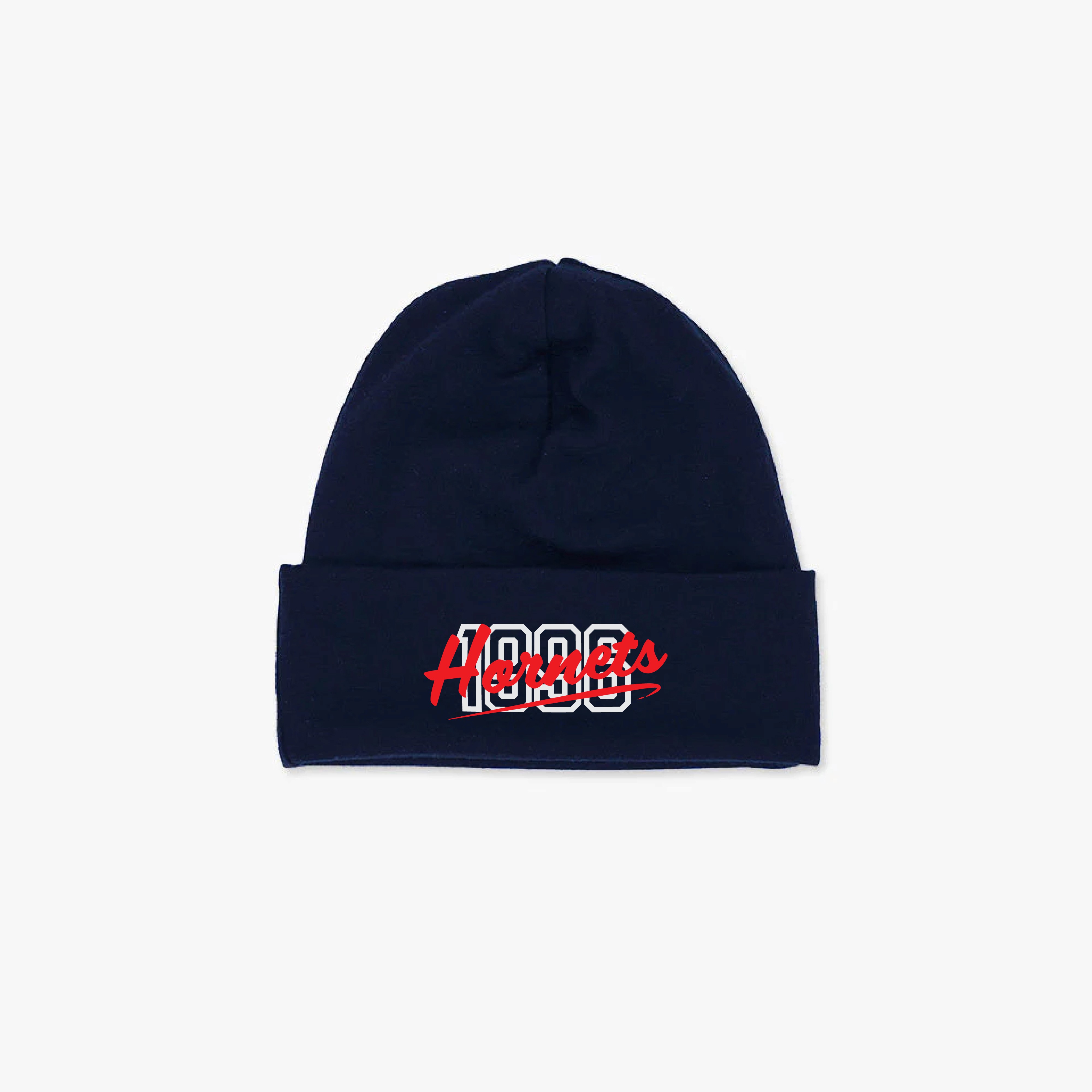
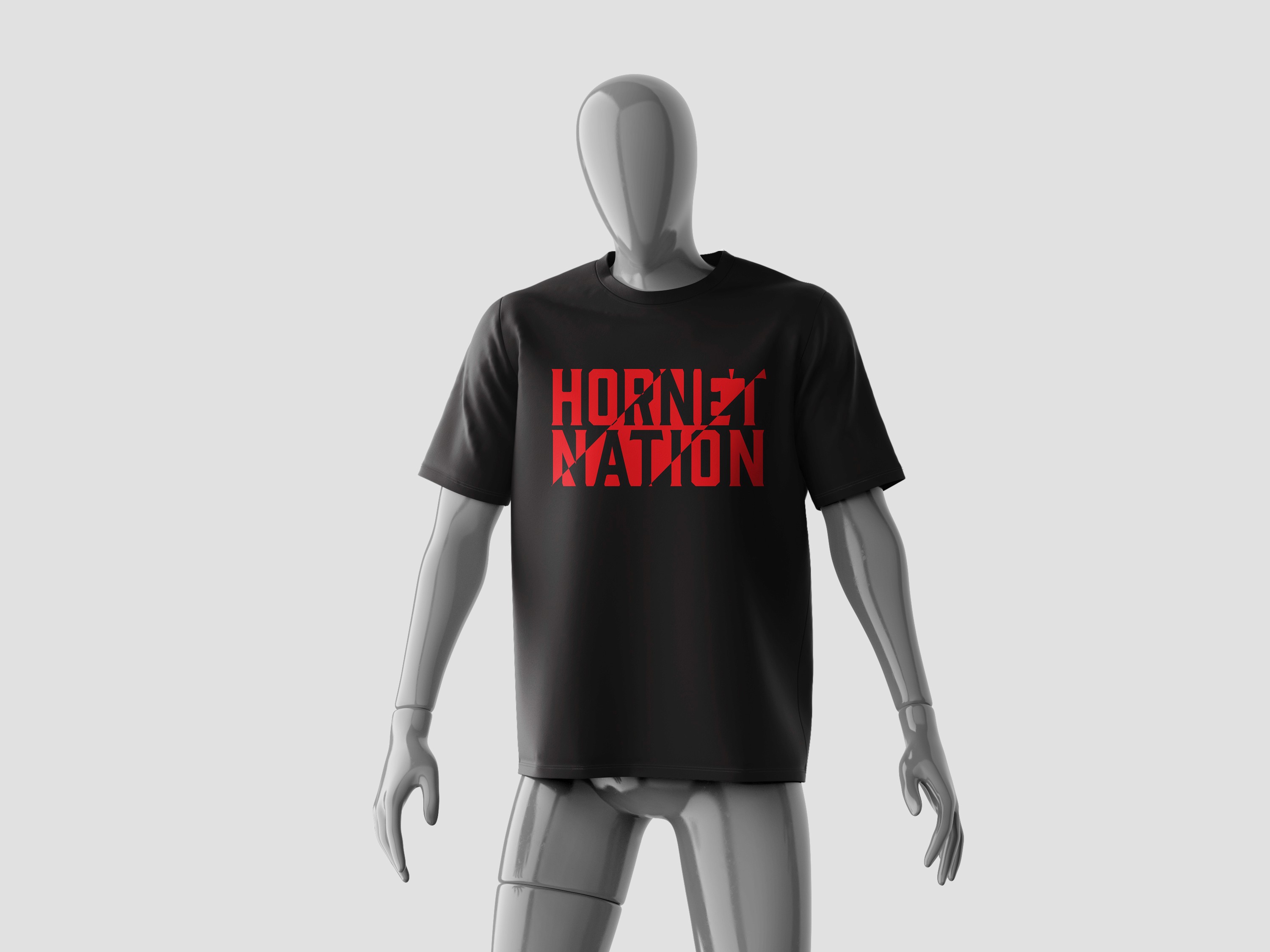
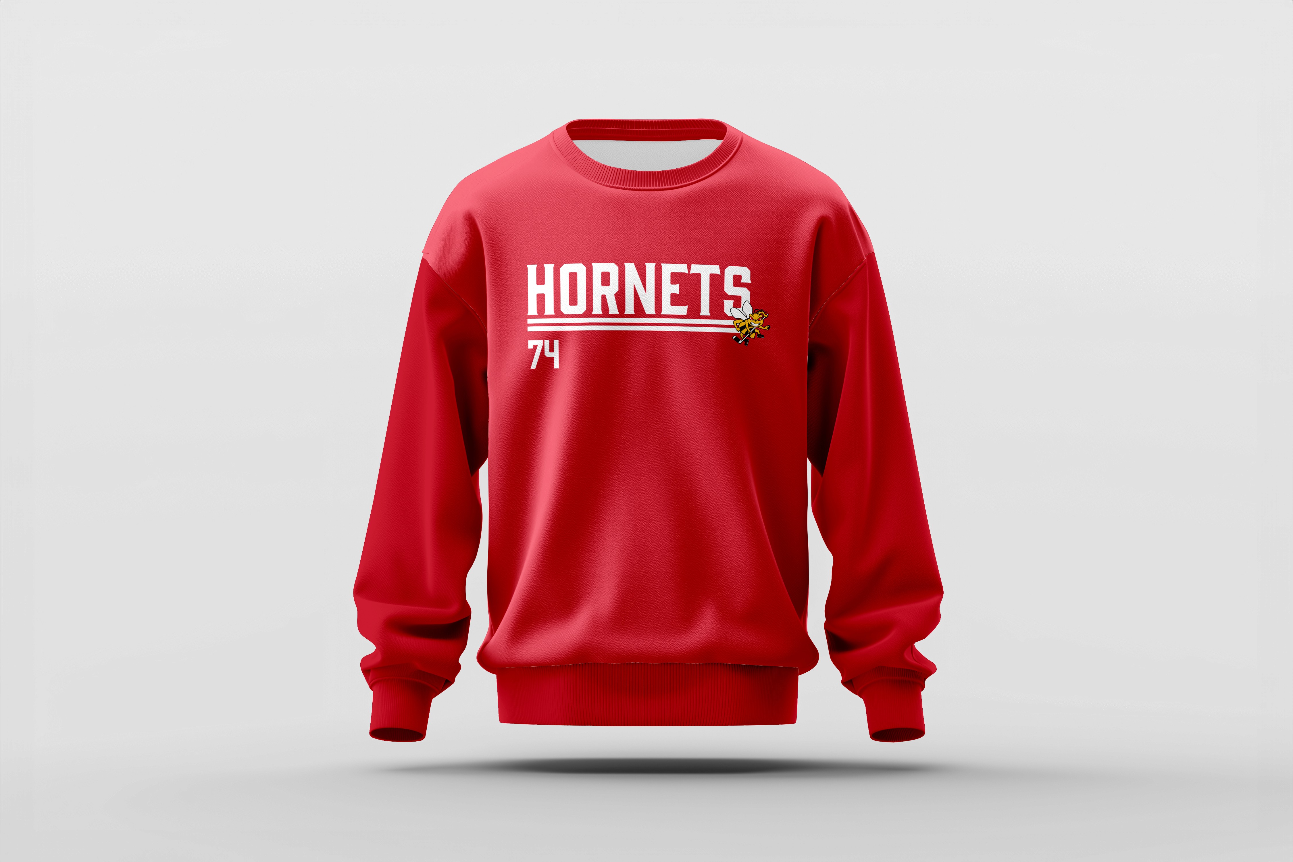
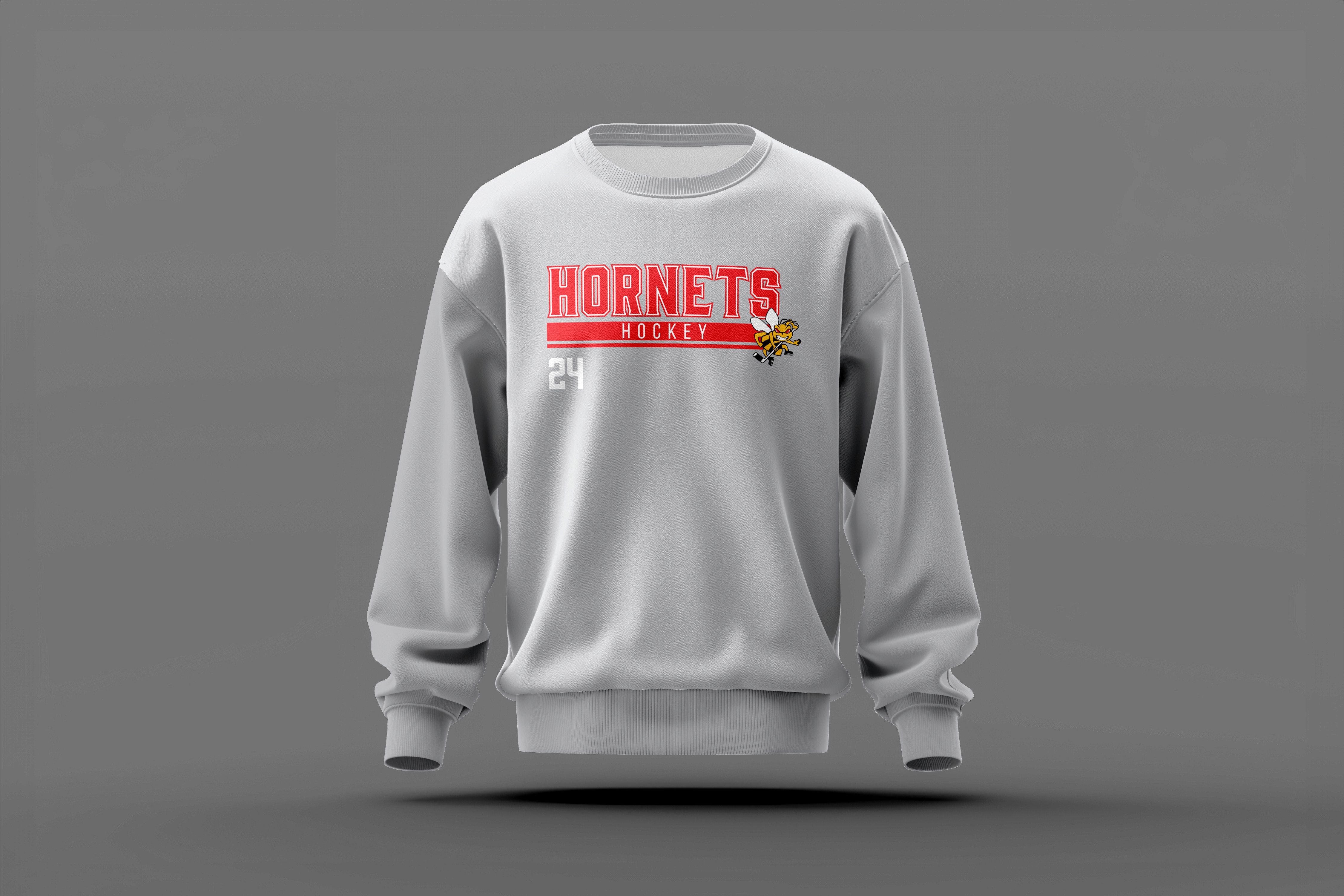
The final solution consisted of a refreshed apparel design system that supports both players and fans across all levels of play. Accessibility, consistency, and confidence were the main priorities across the entire apparel experience, with each design developed to work across various apparel types while also supporting customization.


Behind the Solution
Research was conducted into NCAA and Major League teams in order to elevate the association's apparel, ensuring the brand gave off the same levels of confidence and professionalism. Research into high level sports branding helped define a bold, positive tone that empowered players while still remaining accessible to fans.
01
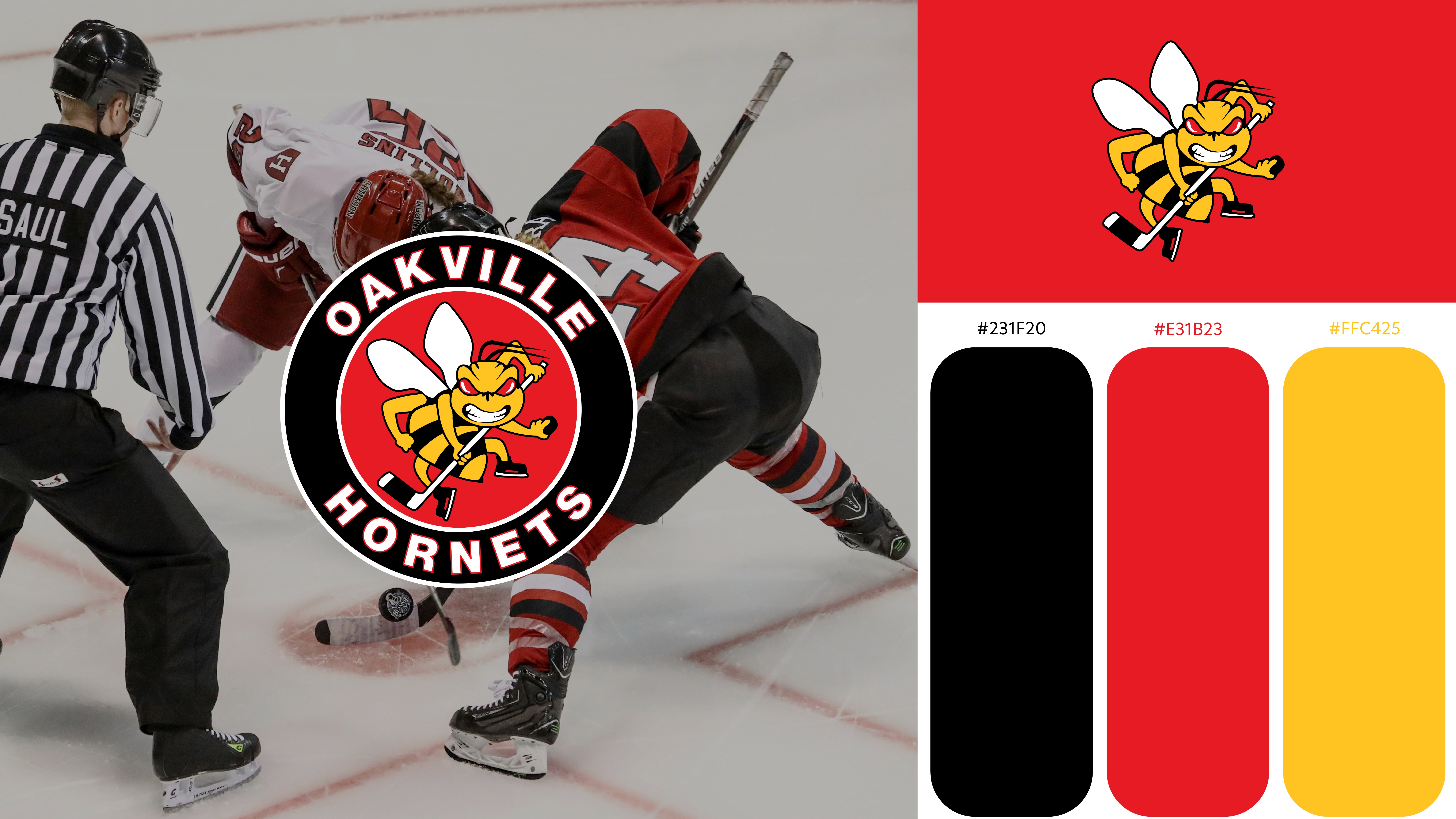
Brand Guidelines
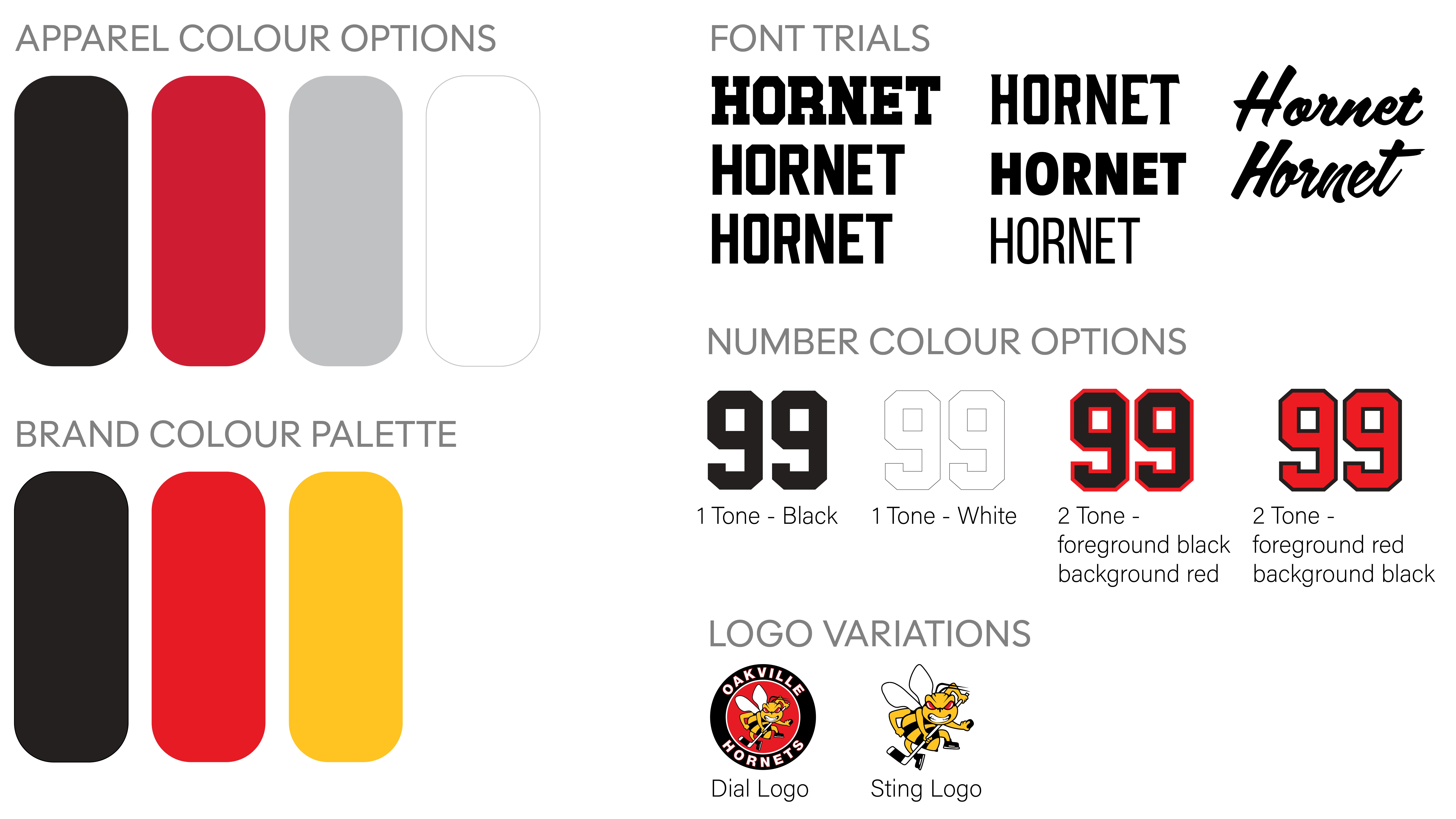
The new apparel designs had to be designed within the existing strict Hornets brand system, meaning existing logos had to be vectorized for consistent scaling, recolouring, and multi use application.
02
Visual Exploration
Designing within the brand guidelines also meant designing for specific apparel colour options with the ability of having multiple uses. Exploration into garment and logo colours, typography, and number colour options for player personalization was key to ensuring logos remained legible across multiple apparel colours.
03
Concept Development
Created multiple drafts exploring layout, typography, and color variations for each logo and customizable element.