Tomo App & Smartwatch
The purpose of this project is to develop a real-time safety and wayfinding system for beginning to intermediate skiers and snowboarders with features like skill-based navigation, real-time guidance, group coordination, and safety support.
Role
UX/ UI Designer
Scope
UX/ Research & Prototype
Tools
Figma, Illustrator, Photoshop, Google Forms
Problem
Ski resorts are very complex environments, and current technology does not support this issue, as post-activity performance tracking is the primary focus for competing apps on the market. Beginner skiers and snowboarders often feel overwhelmed by trail maps, colour ratings representing difficulty, organizing group trips, and quick access to safety features is limited.
Competitive Analysis
To get a better understanding of existing apps in the skiing and snowboarding sector. A competitive analysis was completed to understand what gaps exist in the market and where our app can gain a competitive edge to provide value for users.

App - Slopes
Pros
Shows progress and personal records.
Interactive maps and live location sharing with friends.
Replay your day with 3D technology.
Cons
Requires premium for majority of features.
Only provides end-of-day performance statistics.
Run detection feature doesn't pick up their progress accurately.

App - OnTheSnow
Pros
Resort-specific weather forecasts.
Access to resort webcams.
View and upload photos of resort conditions.
Compare conditions between different resorts.
Cons
Interface is very busy with ads and external links.
Snow conditions don't update regularly and this feature can be inaccurate.

App - Snonav
Pros
In-ear navigation with audio cues for directions.
Choose and plan your route.
Live lift and trail updates.
View group location and set meet-up spots.
Download maps and get navigation without cell service.
Cons
Need headphones for the audio navigation.
Subscription fee, even though it's advertised as free.
Limited resorts offered.
Decreases battery life faster.
Solution
Our key differentiation is that, instead of tracking your day once it's over, users can make better, safer decisions in real time with insights from the skiing and snowboarding community using the Tomo app and our smartwatch.
Onboarding - Sign-up
The onboarding process was designed so all of your information is gathered to ensure every user has a personalized experience with Tomo. Users are prompted to create a profile to participate in community insights and see how every run differs based on real riding experiences. You can also set preferences for how often you want to see safety alerts and if you want to share your live location with friends, as well as enable emergency alerts and prepare yourself by setting up an emergency contact.
Onboarding - Watch Pairing
In case users don't own the Tomo smartwatch they can still use the app by bypassing the smartwatch pairing and choosing to use the mobile app only, allowing them to still use all the mobile features.
Adding Friends & Creating a Group
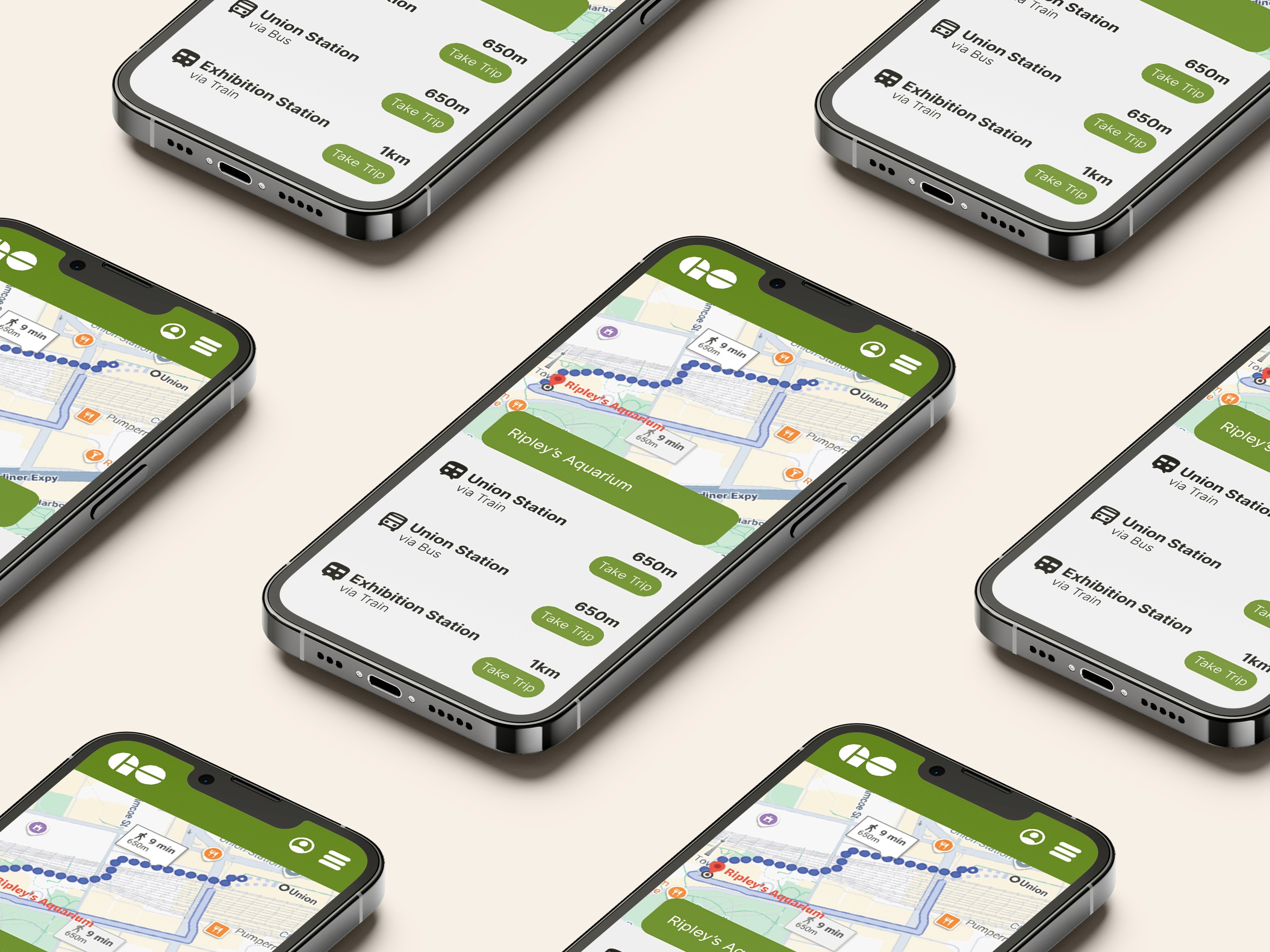
QR codes were implemented to add friends since I wanted to minimize the amount of clicks within the user journey and eliminate unnecessary typing, as users may be wearing gloves on the mountain. You can then add your friends to a group, which can be customized by changing the group name and picture. All friends added to the group will have to accept the invitation, which will notify them by vibrating their watch. The group feature allows you to quickly check in with group members to let them know your current location, alert them in case of emergency, and view their live location.
Slope Hazard Alerts
With the help of the Tomo community alerts feature, users can view and filter alerts by most recent, level of risk, and proximity. Consistent iconography was created for easy recognition, with the shape and colour determining the level of severity. Each alert provides the slope it's located on, proximity from your current location, time it was posted, confirmation amount and comments, as well as the option to view the alert.
Slope Insights
Users can also view reviews from fellow riders with the ability to see difficulty reports, which put into perspective what a run feels like based on other users' immediate snow conditions and community experiences. All community insights include the user's skill level, which shows legitimacy.
Set a Meeting Spot & Route Overview
When a group is set up, you can quickly track your friends' live location and set a meeting location. Once a meeting location is set, you can go through an overview of your route that is personalized to every user's skill preferences. This overview also provides the option to view possible hazards you may encounter on your route, which will all automatically sync to your watch.
Follow Along on Your Smartwatch
Once you're following along on your smartwatch, you can directly add alerts from your watch that you may encounter to keep the Tomo community updated without ever having to pull out your phone. Your watch will also vibrate within 100m of your next move to ensure you never miss directions. Based on your alert preferences, you can customize how often you're alerted of upcoming hazards. The higher the severity, the more intense the watch vibration alert will be.


Behind the Solution
In developing the final prototype this project took a user-centred design approach to better understand beginner needs in order to solve current pain points. Explore how this was accomplished…
01
Research
I designed a survey targeting beginner and intermediate skiers and snowboarders. The goal was to understand their frustrations, anxieties, and what would enhance their mountain experience, from improving safety to helping them have control on the slopes.
Suvrey Analysis
Out of 35 user research survey participants, when asked this multiple-selection question, "If you were skiing or snowboarding, which features would be most useful to you? Select up to 3." These are the final results for all experience levels, ranging from first-time rider to expert, all within the age range of under 18 to 54.

The data was then further analyzed and organized into three primary user groups: beginners, intermediates, and individuals who are interested in trying snowboarding or skiing for the first time. Through the survey results we were able to focus on what features they would find most useful within the app according to individual needs.

Interview Quotes
“Not all blue trails are created equal… one may be narrow and icy, leading to risk of injury.”
“I’m learning snowboarding and don’t want to end up on a black diamond and get injured.”
“It would be nice to know if a run is icy before I go on it so I can avoid it.”
“Every time I go up the chairlift, I would check if the trail is within my skill level.”
“Ratings from other riders are easier to relate to than the general difficulty labels.”
“Seeing where my family and friends are would make me feel the safest.”
“I trust other riders — I don’t want to end up on a super scary mountain.”
“I don’t know what to do in some emergencies, so having an easy answer is nice. and would make me feel less anxious to ski”
02
Brand & UI Guidelines
To ensure the features addressed real user pain points, I designed a survey targeting beginner and intermediate skiers and snowboarders. The goal was to understand their frustrations, anxieties, and what would genuinely enhance their mountain experience, from improving safety to helping them feel more confident and in control on the slopes.
![Brand card for TOMO featuring a snowy mountain landscape with a gondola on the left and a visual identity system on the right, including the TOMO wordmark, mountain logo, and color palettes for day mode, night mode, and safety alerts. Photo credit: Kofler, M. (n.d.). A ski lift going up the side of a snow‑covered mountain [Photograph]. Unsplash. https://unsplash.com/photos/_4LCq7koR10 (unsplash.com in Bing)](https://framerusercontent.com/images/CKTxD9xPlfCVThFUyd3eYA5Urk.jpg?width=8000&height=4500)

03
Mapping the Journey
Mobile Site Map
My research showed that users wanted a broad set of features, which made it important to plan how everything would connect. Building a mobile site map helped me organize these features and design a smooth, intuitive flow for the app.

04
Smartwatch Exploration
A lot of planning went into designing the smartwatch itself, because this kind of device doesn’t exist yet. There were no preset screen sizes, specs, or UI patterns to reference, so I had to define them from scratch. My goal was to create a watch face large enough for users to quickly glance down and get the information they need without squinting, zooming, or breaking focus, something that’s especially important for beginners and in situations where distraction could be dangerous.
Sketches
To make sure the display could hold all the necessary information without overwhelming users, I started by sketching out a horizontal screen that could sit comfortably over thick layers like jackets. I also reconsidered the traditional buckle strap, knowing users might be wearing gloves, and instead created a strong magnetic band to make fastening the watch quick and effortless.


Paper Prototyping
The screen was a key focus, and I tested multiple sizes and ratios to find one that could display all essential information clearly at a glance. To get a realistic sense of scale, I created paper prototypes and had people try them on their arms for quick user testing. Their feedback helped me narrow down the most comfortable and readable options, which led to the two final specs shown below: a 3.25" display for adults and a smaller, kid‑friendly 2.85" version.


3D Model
I then created a 3D render to get a clearer sense of how the smartwatch would look and function in real-life use. Since this is a completely new gadget on the market, it was important for me to visualize it in context and help users understand how it would appear and feel in real time.